Software Marketing – How You Design a Product You Can’t Touch
Selling an invisible product, such as a software, is hard. We want to show how visuals play an important role in software marketing.
Software marketing is a whole different thing than product marketing. It’s much more difficult to visualize the product you want to sell. Thus I will give you an introduction on how you design a product you can’t touch based on our SDK.
Especially the homepage plays an enormous role in the marketing process. I will discuss the three must-haves for your homepage: The value of your product in one phrase, the target personas, and the CTAs. Visual content, no matter if graphics, images, or videos is a must to create successful software marketing and I will tell you why.
The Visuals – It’s Kind of a Di”SAAS”ster
It’s a fact that software is neither physical nor visual. So how to design a product you can’t touch or even see? Getting the attention of a customer isn’t that easy today because we are all snowed under with information in daily life. Considering that more than 65% of us are visual learners, visual content will always be more effective than written content. However, designing the right visuals for an untouchable product sometimes feels like trying to catch an invisible creature.
3 Must-Haves for Your Homepage
Especially for a software provider, the website is the most important “salesman” of the company and a key factor for software marketing in general. It’s important to think through every section regarding content and design. So the website is like a 3-seconds pitch with only one question left “Should I stay or should I go now?”
These are the most important factors for a successful homepage:
- The one-liner,
- the target persona and
- the right CTAs.
1. The Value of your Product in one Phrase
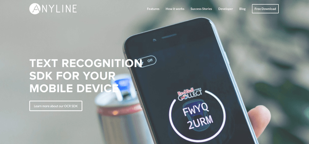
It is a golden rule that you have to see within the blink of an eye: “What are they offering?” and “What’s the value for me as a customer?”. And of course, this is even more important if you are not able to put a nice image of your product next to your catchy phrase – e.g., software. Therefore an image of the process, or of the result of your product may be a good way to show the visitor immediately what your product is about.
As you can see below we show a project with the function of our software plus a short sentence. The slogan is also comprehensible for people who don’t know what SDK means: “Text Recognition for your Mobile Device!”

2. Target Personas
In most cases, you know the target persona of your product or your software but there are always some special cases. Especially with software or SDKs, you have to reach out to different target audiences.
On the one hand, you have the stereotypical developer with a hands-on mentality, who will work with the software. On the other, you have the manager who has to understand the advantages and output of the software, who won’t come in contact with the software itself.
In this special case, you have to provide attractive information for the developers as well as for the non-developers. Successful projects are a big factor for a manager’s decision and should be present on the homepage.
3. CTAs
Obviously, I know — but there is one big difference between the marketing of physical products and software. Usually, you don’t buy software on the first visit because you want to make sure that it’s the right choice for you. Thus the companies provide a free trial.
So the CTAs on websites of software companies still have to convince the user that the software is worth buying. So instead of a “buy now”-button there has to be a “free download” or “free trial” CTA to get the future customer’s trust.

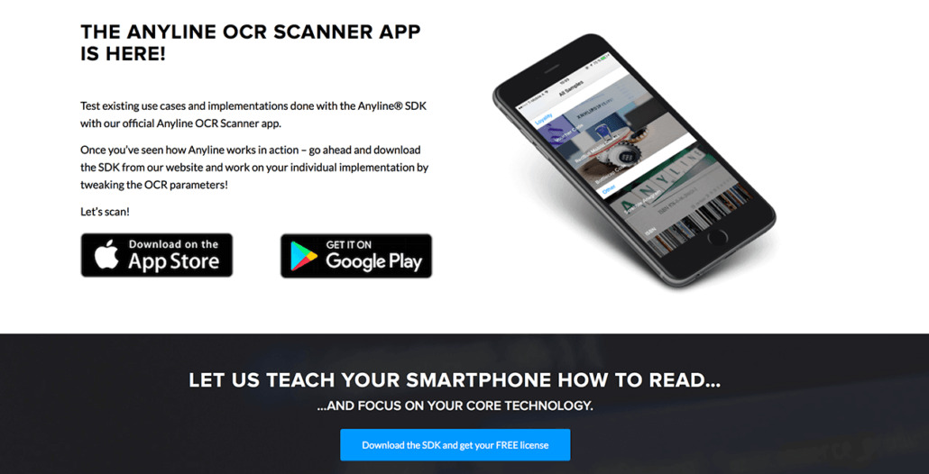
For our SDK there are two ways of learning about Anyline. Either you test our Demo App, which showcases all the different implementations Anyline offers. This app is for the developer as well as for the non-techy customers. Or, the second way is that you directly download our free community version. For us, it was important to give both target audiences equal opportunities to click the right button for them.
Visual Content
Visuals are the best way to create easily understandable content and to make software visible – no matter which visuals. Three days after reading 65% of the information will be remembered if there is an image paired to it, otherwise it’s just about 10%. As I mentioned earlier it’s hard to explain the software to different target audiences but visuals are perfect for it. As we already know, the software isn’t a product you can take nice images of – it’s not physical. You could make a package design or a fantasy 3d-object of it but it will not explain the core product.
So we have four different ways to explain an application in software marketing. The icons, the images for potential use cases, the graphics e.g. for the work process, and last but not least the videos for the lazy ones. To be honest who doesn’t like to watch videos.
Graphics, Graphics and more Graphics
In my opinion, graphics are the most important instrument to explain a complicated product. Why? — Because there is no limit to creativity and you are able to simplify complex processes. If you hear about something for the first time and you are not quite familiar with the terms, a graphic will make it easier to understand. To assure an easy understanding, the important fact is to use icons or elements that the society is used to e.g. a logo or a worldwide known pictogram.
And that brings me to the next point – icons.

Icons
There are two common ways to use icons. Either you use the icon to emphasize an important term or the icon stands alone. It’s space-saving and in the best case self-explaining. For a software company, it’s important to describe the benefits in a plain way. With an icon this is so much easier – you will get the point even if you don’t read the whole description.

Images
The next level is the image. If you sell an intangible product you have to show the result of happy customers using your service. There is almost no difference between being a big coffeeshop company or a software provider. You not only have to persuade the future customer that your service is functional and solves his problem. You also have to show that the use cases are exactly what he is looking for. So images of use cases and the result of the service are a big decision-maker, especially from a manager’s perspective.
Videos
Now we are getting to the lazy part — for the viewer of course. Making videos is really time-consuming and needs a high quality to impress the audience. Videos are higher risk because it’s a lot more expensive and if you don’t invest in a professional it could be all for nothing.
The quality is just as important as knowing your target audience. Tutorials are a popular format for a developer to get an easy intro in the software workaround. Managers are not interested in this kind of format, they want to see the benefits again and in the best case as a video of a use case.
For the tutorial, it’s easy to decide what you need: a screencast of the software and a developer who explains every single step. There are thousands of good examples already online. The crucial factor is the duration and the level of knowledge you expect. If you’re interested just check out our first tutorial of the Anyline SDK.
For the marketing channel, it’s not that easy because there are hundreds of different ways to make a video. Do you want real people in a real environment? Or is an animation the better way to send the right message? It is wrong and right and it depends on the target audience. To sum it up, making an animation is less effort, it’s easily adaptable and sometimes the better way to explain a complex product.
Conclusion
As you can see there are a lot of different ways to “design” an invisible product, especially in regards to software marketing. It’s not about the visualization of the product but to explain the product with visual content. Don’t forget that the website is your most important salesman or let’s say the packaging design of your product – it explains the most important fact before you even see the core product.

